Commit Graph

6 Commits

Author SHA1 Message Date
wxiaoguang 027014d7de
Fix webauthn regression and improve code (#25113)
Follow:

* #22697

There are some bugs in #22697:

* https://github.com/go-gitea/gitea/pull/22697#issuecomment-1577957966
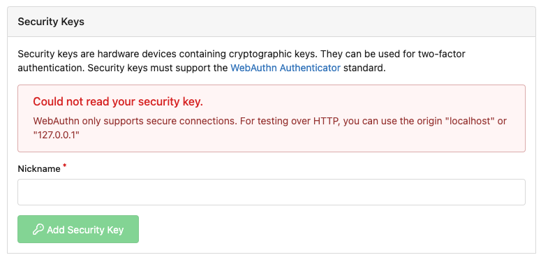
* the webauthn failure message is never shown and causes console error
* The `document.getElementById('register-button')` and
`document.getElementById('login-button')` is wrong
    * there is no such element in code
    * it causes JS error when a browser doesn't provide webauthn
    * the end user can't see the real error message

These bugs are fixed in this PR.

Other changes:

* Use simple HTML/CSS layouts, no need to use too many `gt-` patches
* Make the webauthn page have correct "page-content" layout
* The "data-webauthn-error-msg" elements are only used to provide locale
texts, so move them into a single "gt-hidden", then no need to repeat a
lot of "gt-hidden" in code
* The `{{.CsrfTokenHtml}}`  is a no-op because there is no form
* Many `hideElem('#webauthn-error')` in code is no-op because the
`webauthn-error` already has "gt-hidden" by default
* Make the tests for "URLEncodedBase64" really test with concrete cases.


Screenshots:

* Error message when webauthn fails (before, there is no error message):

<details>


![image](https://github.com/go-gitea/gitea/assets/2114189/93cf9559-d93b-4f06-9d98-0f7032d9c65b)

</details>

* Error message when webauthn is unavailable 

<details>


![image](https://github.com/go-gitea/gitea/assets/2114189/ffc0fcd9-b93b-4418-979c-c89bb627aaf2)

</details>
2023-06-07 19:20:18 +08:00
silverwind a7e18b9fb7
Rework Oauth login buttons, swap github logo to monocolor (#24740)
Diff without whitespace:
https://github.com/go-gitea/gitea/pull/24740/files?diff=unified&w=1

- Use SVGs for GitHub and GitLab oauth providers
- Replace section wrapping with a divider
- Rework icon rendering, increase size from 32px to 40px

Before:

<img width="853" alt="Screenshot 2023-05-15 at 21 54 23"
src="https://github.com/go-gitea/gitea/assets/115237/6ab5cfb4-46ff-469a-bd1f-06780d4a6a0b">

After (more providers):

<img width="849" alt="Screenshot 2023-05-15 at 21 51 21"
src="https://github.com/go-gitea/gitea/assets/115237/fa84f92f-98e0-4aed-9357-5d62ddd98195">

<img width="856" alt="Screenshot 2023-05-15 at 21 56 45"
src="https://github.com/go-gitea/gitea/assets/115237/d3edd7ed-dadd-4302-aca7-08f20adc220e">


Ref: https://codeberg.org/Codeberg/Community/issues/1023

---------

Co-authored-by: Giteabot <teabot@gitea.io>
2023-05-15 22:46:51 +00:00
silverwind 9f6bc7c6f4
Replace tribute with text-expander-element for textarea (#23985)
The completion popup now behaves now much more as expected than before
for the raw textarea:
- You can press <kbd>Tab</kbd> or <kbd>Enter</kbd> once the completion
popup is open to accept the selected item
- The menu does not close automatically when moving the cursor
- When you delete text, previously correct suggestions are shown again
- If you delete all text until the opening char (`@` or `:`) after
applying a suggestion, the popup reappears again
- Menu UI has been improved

<img width="278" alt="Screenshot 2023-04-07 at 19 43 42"
src="https://user-images.githubusercontent.com/115237/230653601-d6517b9f-0988-445e-aa57-5ebfaf5039f3.png">
2023-04-09 12:18:45 -04:00
silverwind ca03ca9e6e
CSS color tweaks (#23828)
Change grey shades in arc-green to match the theme more:

<img width="661" alt="Screenshot 2023-03-30 at 21 42 34"
src="https://user-images.githubusercontent.com/115237/228957952-8e099e56-6923-4aa6-8ce9-3c1cd898b73e.png">

Adjusted grey shade in light theme:

<img width="652" alt="image"
src="https://user-images.githubusercontent.com/115237/228963876-3bde6181-8397-4dc2-be72-33982e6c7acb.png">

Increase contrast in arc-green, change background to slightly darker
shade, change forgeground to slightly brighter colors:

<img width="283" alt="Screenshot 2023-03-30 at 22 33 20"
src="https://user-images.githubusercontent.com/115237/228957957-272c24a5-dd0b-427a-b6b7-e62836bdd73c.png">

Increase contrast of grey text in light theme as well by making them
darker:

<img width="273" alt="Screenshot 2023-03-30 at 22 33 35"
src="https://user-images.githubusercontent.com/115237/228957959-283139c7-6fa7-4b68-9fdd-16c668ad1301.png">

Add color rule for border multiple select items:

<img width="183" alt="Screenshot 2023-03-30 at 22 29 31"
src="https://user-images.githubusercontent.com/115237/228957954-6b5a752d-bbb0-4519-ab35-d02c0804d955.png">
<img width="181" alt="Screenshot 2023-03-30 at 22 29 46"
src="https://user-images.githubusercontent.com/115237/228957956-fca9790a-d6c9-4f31-8d1b-d183ab3ac669.png">

Added color rule for red `*` on required form fields:

<img width="97" alt="image"
src="https://user-images.githubusercontent.com/115237/228958760-517ad9ef-565d-4349-b734-9b559ab42429.png">
2023-03-31 16:24:47 +08:00
Hester Gong d42015e6eb
Fix long name ui issues and label ui issue (#23541)
This PR fixes some ui problems as mentioned in the two issues below.
1. Long file path has no word break

## Before
<img width="1357" alt="截屏2023-03-17 17 49 43"
src="https://user-images.githubusercontent.com/17645053/225873491-27c7bf9a-d5d5-4065-9e4a-ff228e935abf.png">

## After
<img width="1248" alt="截屏2023-03-17 17 51 22"
src="https://user-images.githubusercontent.com/17645053/225873562-93b87af7-9c83-43f8-aa0d-36a9174d25ac.png">
on mobile
<img width="408" alt="截屏2023-03-17 17 51 15"
src="https://user-images.githubusercontent.com/17645053/225873554-1b8c8999-1dfc-4251-a7fc-20ecd3444cb0.png">


2. Texts in labels  
## Before
<img width="1219" alt="截屏2023-03-17 17 49 24"
src="https://user-images.githubusercontent.com/17645053/225873369-812b1b52-c104-4e32-988f-c3e55ad2f844.png">

## After
<img width="1259" alt="截屏2023-03-17 17 51 31"
src="https://user-images.githubusercontent.com/17645053/225873317-9717fd2c-e9e1-4a00-a27d-6bdc5933c3ca.png">
with two labels
<img width="1258" alt="截屏2023-03-17 17 51 53"
src="https://user-images.githubusercontent.com/17645053/225873323-13198192-71de-472d-8e78-6fd86ddba3d9.png">
In explore and star pages
<img width="896" alt="截屏2023-03-17 18 25 00"
src="https://user-images.githubusercontent.com/17645053/225878962-9e26e3aa-cff0-451c-9133-19f4ad1507a4.png">

<img width="913" alt="截屏2023-03-17 18 25 09"
src="https://user-images.githubusercontent.com/17645053/225878967-6adaa414-136e-43c2-87d0-7e46a0da112e.png">

3. Long name repository on creating new fork page
## Before
<img width="919" alt="截屏2023-03-17 17 50 01"
src="https://user-images.githubusercontent.com/17645053/225873723-5c4ea137-3b51-4074-a458-ef442e330ddf.png">

## After
<img width="907" alt="截屏2023-03-17 17 50 37"
src="https://user-images.githubusercontent.com/17645053/225873772-fc4a52c3-49c6-4ca6-903d-a13707f2a98b.png">

<img width="383" alt="截屏2023-03-17 17 50 48"
src="https://user-images.githubusercontent.com/17645053/225873779-6de1dfde-5c05-4ae9-89e1-85c25b3a1682.png">

Closes #23535
Closes #23534
2023-03-18 17:07:59 +01:00
silverwind 202803fc69
Replace Less with CSS (#23481)
Ran most of the Less files through the Less compiler and Prettier and
then followed up with a round of manual fixes.

The Less compiler had unfortunately stripped all `//` style comments
that I had to restore (It did preserve `/* */` comments). Other fixes
include duplicate selector removal which were revealed after the
transpilation and which weren't caught by stylelint before but now are.

Fixes: https://github.com/go-gitea/gitea/issues/15565
2023-03-14 22:20:19 -04:00